.png)
Warner Bros, one of the giants of the movie industry recently, introduced its new logos to be launched in 2023. The logo, which will enter 2023 completely in honor of the 100 years of the company, was prepared by a design firm called Pentagram. The new logo, which has very simple and straight lines compared to the old logo, prompted us to reflect on the adventure of big companies to change the unresponsive old logos in new media.
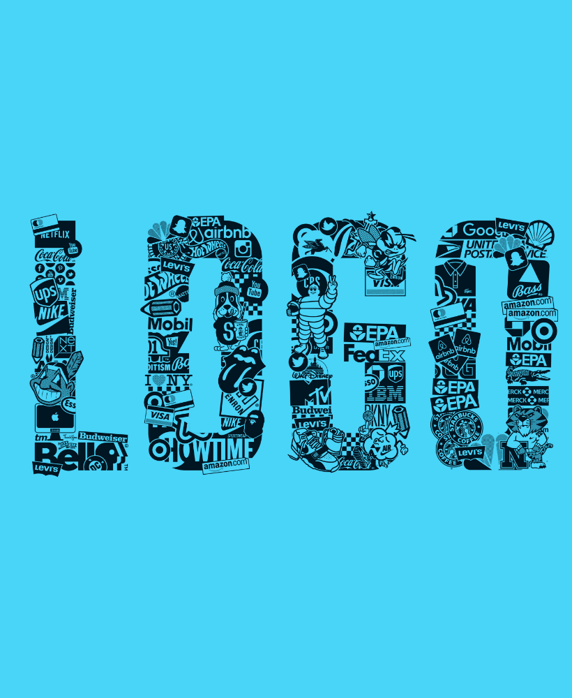
If you are a bit interested in design, you should have come across a list of contents on social media or search engines about the logo changes of famous brands over the years. Big brands are changing their logos more often than we can. While some brands continue on their way with simple color and font arrangements, some are going through more radical processes of change.
Most of all the big brands we know of in the last decade have at least felt the need to edit their logos. So where does this love for change come from?
New Channels New Logos
Now a brand's logo is published in many different areas. In the past, it was not possible to see the logo of a business anywhere other than signs, invoices and business cards. Now the smallest brand and the largest can come together in digital media.
New channels have their own demands. When you use logos on Instagram, Facebook, your website, your Google ads, you do not have the freedom of shop signage. You must meet many requirements such as aspect ratios, color schemes. Otherwise, the efficiency you get from these channels may be adversely affected.
In addition, people's relationships with these new media are different from the old ones. The time to look at a logo on your invoice and the time to look at an advertisement for your brand is not the same. There are also big differences in attention. People are exposed to so many ads now that logos are almost invisible.
Most of the ad spaces do not have the old prestige. The cost of advertising has also dropped dramatically. Digital came, manhood was broken. In the past, the prestige of advertisements given on the back page of a national newspaper, on a billboard in a city square, and Instagram ads were not the same. Now, the ads of the biggest banks and the shipments of the snack shop in our neighborhood are arranged in the same flow.
With this prestige decline, the size also fell. Full page advertisements in newspapers were replaced by posts that took up 350X450 pixels space on the phone screen. In so few areas, people exposed to so many commercial shipments ignore and forget most of them.
For all these reasons, big brands are starting to change, revise and update the logos they used to use. They are moving towards compatible logos that can be used on TV screens, social media, newspaper advertisements, banner advertisements, newspapers and all other areas I cannot write the name of.
Does Your Logo Need Renewal?
Let's come on the side of the issue that concerns us. If you say “what is the Warner Bros logo” to us, I agree. The place I want to bring the subject is your logo. Opportunity changes that underlie all this change also apply to you. Does your logo also need change?
To answer this question, we have prepared a short checklist below. Review the list below on your own business or brand logo. Finally, the decision is yours.
Which Areas Do You Use?
First of all, you should determine the usage areas. In which areas your logo is visible to your customers. Social media, offer form, business card, banner ad… It will be useful to determine these areas for your business model to get maximum efficiency. The big companies mentioned above use all possible channels. Compatibility for them is paramount. It is recommended that you switch to a logo design compatible with all media. However, ranking the channels in order of importance will determine which area should be given weight.
Is It Possible To Remember?
Now people see too many ads and logos. They have neither time nor attention to review your catalog, website, offer, or advertisement. To do this, you should demand as little time and attention from people as possible. It is important that your logo is understandable and recognizable at a glance. To do this, show your logo to someone who has never seen your logo before, give it 5 seconds and ask him to draw your logo. Which details he remembers and which he doesn't remember will be decisive for you. You can consider redesigning your logo based on the details that it is not difficult to remember.
Use on Different Colors
In the past, all logos were used on white. The situation is a little different now. Social media channels, mobile areas such as YouTube, banner ads, the areas where the logos are used are filled with colors. You should try your logo on different color backgrounds. Just white on black and black on white will not be enough. For your logo, you should consider a color variation that allows it to be used on different color backgrounds.
Independent Icon
Your name is written right next to your profile picture in all social media channels. If your logo consists of your name, you write your name side by side twice. Also; You can't expect anyone to try to read your name in that tiny profile picture area on your phone screen.
It's time to think of an independent icon for your logo. An icon that will remind you, available to be used on your profile screen, on the icon of your site… So people don't have to read your name to get to know you.
Result
The only thing that does not change is change itself. No invoice designs and business cards that give us horizontal and large areas to place our bee logo. All brands have to present themselves in a round profile picture. For this; We need logos that look at one time is enough to be recognized, can be applied smoothly in all channels, and that do not lose their identity when used on different colored backgrounds. Nobody can guarantee that this will be your final logo. When the channels are updated, we may have to be updated.
