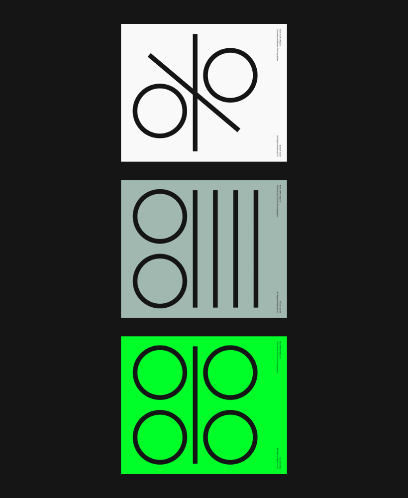
Whether you're designing a website or an application; User interface design is one of the most important variables in order to establish an effective communication with the target audience and to convey the message of the represented brand correctly. There are various principles that should be considered when designing user interfaces, and the use of color has a very decisive importance within these principles. Because the preferred colors evoke different emotions in the user and with the right color selection, a strong interaction can be established with the target audience. In this article, you can find information about the use of color in interface design; You can discover the importance of colors for brands.
Correct Pattern and Correct Colors Should Be Matched
Those who want to use colors both correctly and wisely in interface design must first know the meaning of colors and the emotions they evoke. Recognition of colors can facilitate the creation of desired changes in users' perception.
Red, orange and yellow are warm colors. They emphasize feelings of comfort and sincerity. However, they can also be used to express intense emotions towards some people, such as anger, hostility, or passion. Blue, green and purple are cool colors. They give confidence, symbolize tranquility. This is the main reason why technology brands are indispensable colors, pay attention to companies that focus on blue tones in their user interface, many of them are world famous technology brands. Black is mystery, nobility, one of the colors that keep corporateism alive in a modern tradition. White is purity, innocence, while symbolizing integrity, its meaning can deepen with the colors used together.
This information about colors is quite general. As a result of the differences between culture and societies, the meanings attributed to these colors may vary. There is also the use of colors together; We can easily state that there are brands that achieve an exciting harmony in the management of positive and negative perceptions and achieve this only by using colors together.
Brand Message Should Be Delivered Correctly
When choosing colors during user interface design, the messages that brands want to give should be reflected in the most accurate way. Thus, studies can be carried out to catch the target audience from their hearts and increase their loyalty to the brand. Each brand has a personality, and the color palette narrowed accordingly can be considered as effective weapons that enable communication with existing and potential customers. Let's make what we mean by sharing a statistics right away. Researches show that the most important motivation of approximately 85% of consumers when purchasing a product is the color of the packaging. This data can be easily imported into user interface designs. At this point, the question of whether it is color by brand or brand identity by color may come to mind, and it should come to mind. This dilemma can be easily resolved with correctly formed corporate identities.
When Choosing Color, Brand and Sector Should Be Considered Together
Knowing the brand, the sector in which the brand operates, and the target audience interested in the sector is critically important for the success of the design. Even if the user interface prepared by ignoring these variables is evaluated as successful, it will be incomplete at some point. This is why conventional colors are preferred by new brands. The power of an acquired awareness often means a quick start.
Balanced Colors Should Be Used in User Interface Design
When evaluating colors and tips on how to use colors, you should not ignore the fact that different color combinations are valuable in interface designs. When creating color combinations, you should take a minimalist stance and ensure that these combinations are used in the most minimal but highly effective way. There are some generally accepted rules in the design world that will enable you to use colors in a balanced way. One of these rules is that maximum 3 main colors should be used. A 60% neutral color, 30% brand secondary color and 10% brand primary color should be used in the interface design. This rule is also called the Golden Rule, when using 60% (dominant color) + 30% (secondary color) + 10% (accent color) the interface can be colored in a balanced and stylish way. Although rules make life easier and make the designed user interface functional, inspiration will always make a difference.
At this point, we want to make another important reminder. As important as the use of colors that are universally preferred in interface designs, is also how these colors are used in a design. When an effective primary color used in a minimal design is used in a more complex design, the result can be uncomfortable.
The Inspiration You Expect May Be Outside
Sometimes, the only way to overcome creativity is to go out a little. Going out is to observe nature, watch the sky, absorb the tones of green. Color combinations encountered in nature will always look natural, and the good part is it is for everyone. Therefore, when you reflect the inspiration you get from nature to your designs correctly, the users browsing that interface will feel familiar and will not find the colors in the design strange. Of course, it is important not to reduce the inspiration from nature to just a few colors. This inspiration should integrate with the colors of the brand, the character of the brand and the message the brand wants to convey. Only in this way can a success be mentioned, designs can come to life with pleasure.
As a result, color selection for user interface designs is not just aesthetic preferences, colors are powerful variables that affect the image of the brand and the perception of the users. Therefore, they have an active role in the user experience. A well-thought-out color palette design has the effect that can transform from good to great or great to mediocre.
.png)


