
Logo Design is the easiest connection that can be established between a business or institution and a person. When I say "the easiest" I'm talking about a connection that a good logo can establish. Because designing a logo and drawing it as usable is much more difficult than you might think. A good logo is not like a good car. It cannot support much grandeur. The strength of the logo comes from its simple yet expressive nature. It should be designed only using what is necessary, as much as necessary. Logo is indispensable for a visionary company that cares about its job and service. An entitled logo work will certainly support the branding of the company and gaining customer loyalty. What should a useful logo look like?
Not a Work of Art, Just the Logo Design
First of all, you design for people. Do not take this out of sight. A very nice graphic design is not a very nice logo. The logo of a beauty salon cannot be the face of Mona Lisa. Our design should contain some messages that people can combine with the business or service in their minds.
Stay Simple
Do the hard thing, stay simple. The most catchy logo design is the simplest. The criterion in this matter is; It is the ability of someone who looks at the logo for 5 seconds for the first time being able to draw the logo. Avoid complex icons and patterns.
Usability
Don't make up your mind without seeing the logo on various backgrounds. Imagine the logo on a black background, on a white background, on a business card, on a 5-meter billboard. If it does not look awkward and lose its form, then there is no problem.
![Coca-Cola Renklendir Yazını Kampanyası]() Aim For Timeless
Aim For Timeless
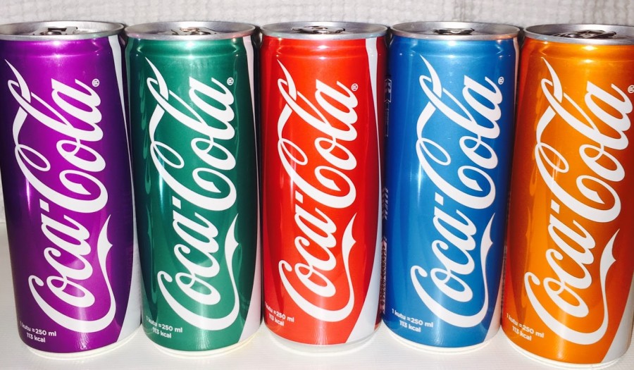 Aim For Timeless
The most important feature of company logos is to gain brand loyalty by giving a feeling of continuity. The popular components you will use in the logo may need to change over time and the logo will lose its continuity. There are companies that have remained stable in logo design for a very long time. These companies make small updates to their logos at regular intervals and continue. They are both up-to-date and able to reinforce a sense of continuity.
Contrasts
The contrasts you will use in the logo design are very effective in terms of simplicity. Using the space inside or at the edge of the logo as an area designed within the logo is important in terms of being noticeable and delaying the message. People have lost their attentional abilities because they were exposed to too many direct messages. In the future, companies' logos and advertising campaigns will almost become a puzzle. They will give you little messages and your brain will complete the rest.
Not a Color Explosion
I am open to objections regarding this issue. Instagram's changing logo can change the trend in terms of color and color transitions. I know that in the new version of IOS, those famous flat designs are being distanced more and more. Instagram is, after all, a platform for photography and color. It is normal for it to be a little more brave. It is a obvious that other social media platforms will not attempt such visual color transitions. But the trajectory we have towards coloring is certain. Color it away but do not exaggerate!![]()
Trendy But Original Logo Design
What does this definition consist of? Fashion is a wide trend that determines what people wear. Style, on the other hand, allows people to differentiate within that trend. Travel along the shores of generally accepted aesthetic rules. Appeal to the eye, but without forgetting the purpose. At this stage, you should know the product and features of the company whose logo you have designed. You should see the competitors' logos ... This part is a bit difficult, I suppose.
Font
Font is also a design product. It adds meaning to a text or kills the meaning. Consider a statement issued by the Presidency written in Comic Sans. Use the font to support the content.
Target Audience
People ... Who will see this logo? Who are the customers? How old are they? You must set an age range. Are the customers men or women? What is the feeling that is planned to bring people to this business? Quality, trust, fast service, reasonable price ..? These are the criteria that will draw your logo. After you analyze these criteria and create a concept, the only remaining job is to fill the gaps.