In the past weeks, there has been a lot of talk about Istagram's changing logo design. The new logo design has even been likened to a washing machine. With this logo excuse, we wanted to take a look at the companies that changed their logo design over time and their logo designs. Should the logos change? In what direction should it change? How should a logo change or a new logo design be, which requires a very bold decision for a company? Finally, are we in a hurry to decide on changing logos?
What does a logo do for a company? How do we, as consumers, benefit from a logo? We have already mentioned a few words about these topics and the subject of Logo Design. Now, it will be useful to take a closer look and focus on this subject over the changing logos. The change of logos reminds me a little of fashion. Of course, this concept of fashion is not something that changes with a quarterly period like clothing. The fashions of the logos are longer processes, and you only have to update them when there are radical changes in people's habits and worldviews.
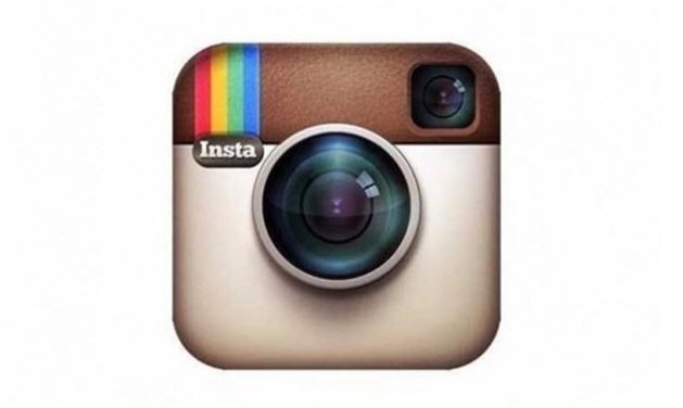
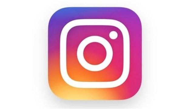
Yeni logo tasarımı daha sade ve net. Fotoğraf imajından çıkılarak tasarıma dönülmüş. Bunu teknik olarak eleştirebiliriz. Hatta er şekilde eleştirebiliriz. Kafamıza göre yani...
IBM
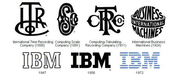
IBM's logo has changed a lot appearantly. Well, it wasn't a bad logo at all. But it also wasn't great. Let's be real, it has seen some progress.
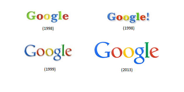
Google has not made much changes in its logo. Excluding the exclamation mark at the end, it only applied the dominant effect of time on the effect of the logo. Perhaps this is the most accurate method in a logo update story.
Foursquare
-No no! Our work is short. Try capital letter, let's see, yes! Should we also put a map pin on top of it as well? How would it look like?
Apple
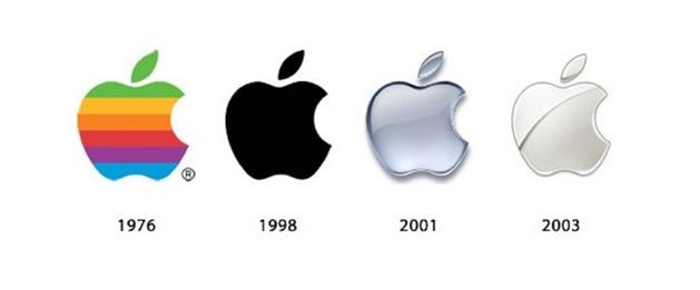
Now leading the fashion trends in the world with its product designs, Apple was never like this before. Like, what the heck is a rainbow apple! Maybe it was the beauty standard back then. Year '76, Flower kids and Apple
Microsoft

The invention of colored printers, year 2012.
Nintendo
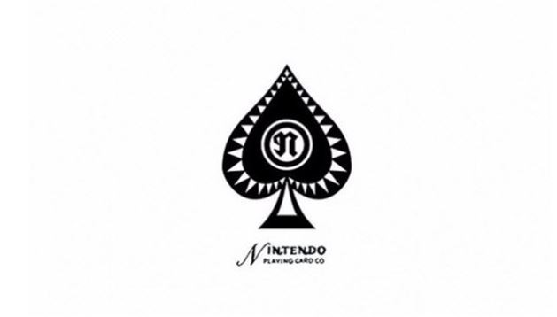
I think the first logo can still be used. 'Nintendo Playing Cards'
Sega
- We need something a little bit more tech-style. Y'know something blue, with wires or something.
Nokia

The first logo is drawn entirely with the thought 'We are from Norway, bro'. When things opened up to the international market, they said, let's change the logo. However, this logo update was not enough to save Nokia.
Canon
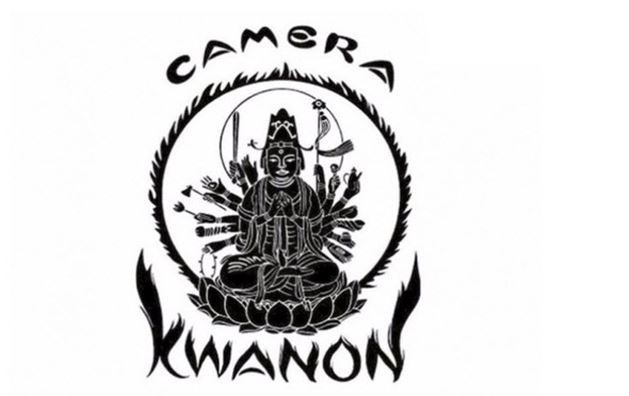
Perhaps the most useful logo change is this. What would you think was sold if 'Camera' wasn't written on the first logo? It seems that the first Logo has targeted the far east market. Both the icon and the word KWANON, which is relatively difficult to pronounce, have changed in the second.
Kodak
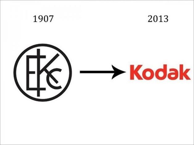
The first logo resembles a pharmacy sign. It has changed in a good way.
Fedex
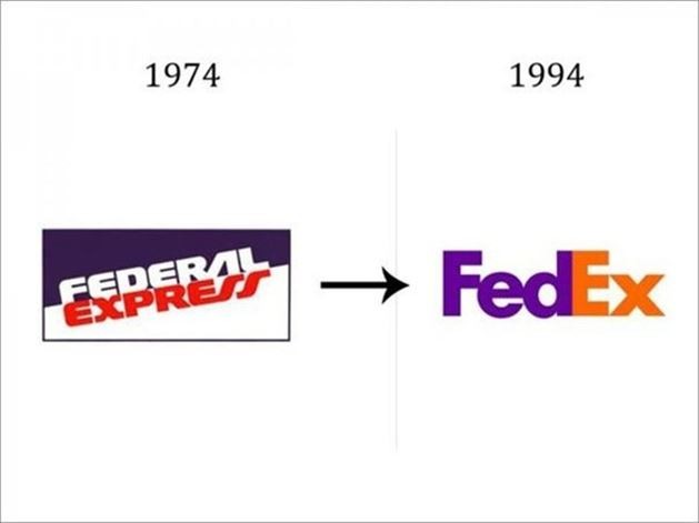
I hope the person who designed this logo is sipping orange juice at his villa in Hawaii as I write this article. Dude, how did you come up with hiding an arrow between E and X in the phrase Fedex. An arrow to forward, representing progress.
Doritos
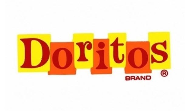
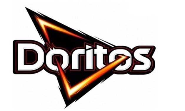
Compare the two logos only in terms of price. Which logo do you think sells products that are more expensive?
Lay's
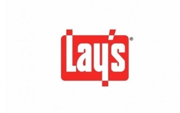
The first logo has "We sell chickens" written all over it dude. If you sell chicken, sell wings, it will work, but it doesn't go well with the potato chips.
Pepsi
- What, coca-cola? I've never heard of it. I am the first to hear from you. Of course, logos look similar sometimes, right?
Pizza Hut
Maybe the first one could be a mascot rather than a logo. Also it's pretty useless. In a poster work where this logo can be seen easily, there will be no room for anything other than the logo.
Shell
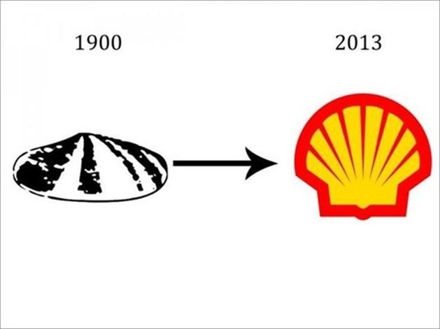
The first logo look like it came out of a copier. The seashell idea is fine sure, but not this literal.
Audi
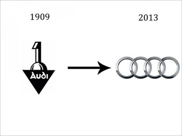
- Dude, write "one" in the logo. The number one you know. '1'. We will be the first for sure. The best. (They weren't)
Mazda
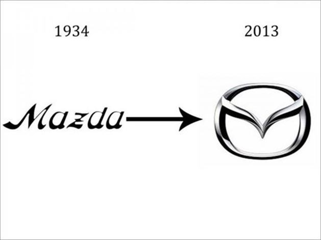
Transition from name to icon.
Saab
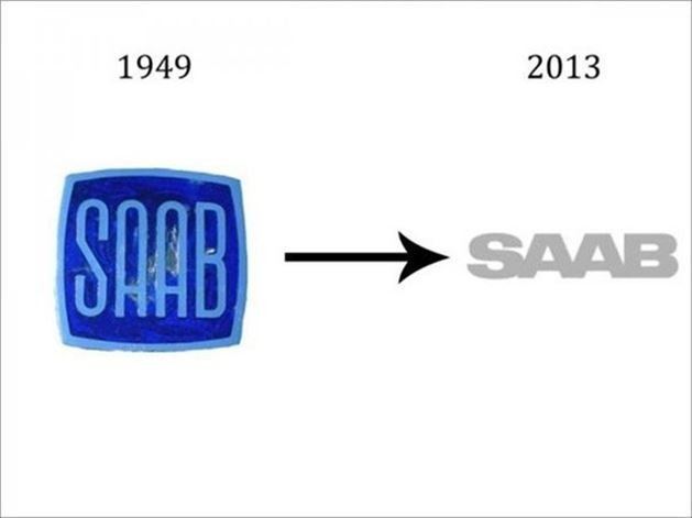
The work of a logo drawn in watercolor. It can even be a potato print.
VolksWagen
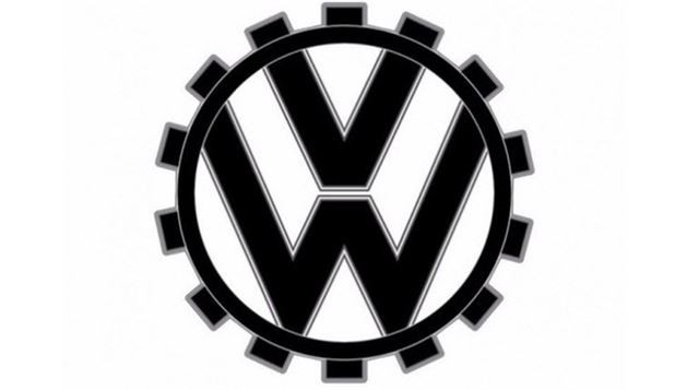
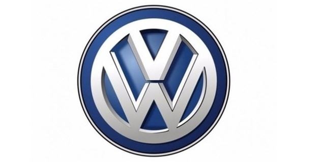
Remove the machine gear from the first logo. Make it manly, make it blue... Wait, that's it!
Conclusion
Do you know that the old logo works you see are beautiful? Like other logos, we should give Instagram some time. We must be patient. And while we're waiting we can also watch this video about its design.
.png)
