.png)
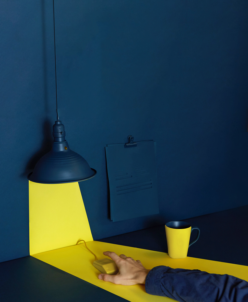
We are here with one of the most popular discussion topics in the design world! There are many different opinions about the dilemma of whether interface designs should be light or dark in order to improve the user experience. In general, dark interfaces are said to be quite remarkable and "cool", while the bright interface is more clean and user-friendly. However, unfortunately, the accuracy of these statements may vary from situation to situation, sector to sector and of course other elements of the design. There is a general consensus that what is important is to perfect the user experience.
Target Audience Should Be Considered While Choosing
While choosing the color for the user interface, it is necessary to know the current and potential customers and to obtain information about the preferences of the target audience. While middle-aged and older adults generally prefer bright interfaces due to their ease of reading, young people tend to prefer dark interfaces. When it comes to children, bright interfaces come to the fore again, because many interesting details can be used simultaneously in bright interfaces.
What is Designed Matters
It is of decisive importance for you that the interface design will be used for what purpose on which platform. If you are going to design an interface for a platform that interacts with texts and videos, you need to choose an interface that will not tire your users' eyes. At this point, bright interfaces will be of great use to you. As a matter of fact, the surveys conducted reveal this fact. 47% of those who use the platforms that read text and watch videos in between stated that they prefer a light interface and 10% a dark interface. But at this point, another issue that you should pay attention to is how much time is spent on the platform. If you are going to design a site or application interface where you can spend a few hours, it would be a better choice to combine a dark interface and lighter text.
At Which Time Of The Day You Will Meet The Users?
While ending the dilemma of choosing a bright or dark interface, you should also consider designing a platform that meets users at what time of the day. For a platform that is visited mostly at night, dark interfaces would be a more logical choice. Because they are visited in the dark environment and integrated with the space. For a platform that is visited during the daytime, it would be better to think the opposite.
What Should Be the Focus of the User?
Interface design should be designed by thinking of many elements simultaneously. Thus, while improving the user experience, companies or individuals can also achieve their goals. Another point to consider when choosing a dark or light interface is where the users are asked to focus. The use of dark interfaces will create an eye-catching effect, especially on websites where luxury products are desired to stand out.
When to Use Dark Interface?
As we have just stated, the answers to this question may vary, but it is possible to make certain generalizations. When there is less text to read, more pictures or videos to view; When there are few elements in the design and when these elements are positioned correctly, when it is desired to create a dark environment for the users, when the main element of the page is aimed to come to the fore, it will be advantageous to choose a dark interface in cases where eye strain is to be prevented during visits that last for a few hours.
When to Use Bright Interface?
It can be said that a bright interface should be preferred when texts are predominantly used in the design, when there are too many items on the screen, when multiple colors are used together in the design and when platforms that can be used more during the day are designed.
As a result, designing an interface requires pursuing creativity as well as following the rules. Regardless of interface color selection, the ultimate goal of interface design should be to create a perfect user experience. Designs that give the target audience the chance to find what they are looking for quickly and easily, do not tire their eyes and also serve brand goals, will always gain the success they deserve.


